Plotting Your Fitbit Data in R
I use a Fitbit to track some basic health statistics, but sometimes I wished that the plots on the app were displayed slightly differently. In this post, I will give a go at making plots that I think would be useful for me.
To do this, I first need to download my data from Fitbit. One way is to export your data manually from Fitbit’s website. Alternatively, they also have an API. In particular, I will use the fitbitr package created by Matt Kaye, which provides an easy way to access your data in R.
Install package
First, install the fitbitr package from CRAN or github and follow the instructions in the package vignette.
# devtools::install_github("mrkaye97/fitbitr")
library(fitbitr)
To briefly summarize the set-up process described in the vignette, what you will need to do first is register an app on Fitbit’s portal here. Copy exactly the fields shown in the screenshot on the vignette. Specifically, it is important that you use “http://localhost:1410/” (including the last backslash) for the redirect URL. This seems to be the URL that R uses for authentication purposes. It does not really matter what you put for the other URL fields.
After you have registered an app, generate a token as shown in the code chunk below. Your client_id (“OAuth 2.0 Client ID”) and client_secret (“Client Secret”) can be found in your app’s details on the Fitbit website. The callback parameter is the redirect URL (“http://localhost:1410/”). The cache parameter is optional. If set to TRUE, it allows you to use load_cached_token() instead of generate_token() in future R sessions.
# Generate token if first time using package
generate_token(
  client_id = "YOUR-CLIENT-ID",
  client_secret = "YOUR-CLIENT-SECRET",
  callback = "http://localhost:1410/",
  cache = TRUE
)
# Load cached token in future sessions
load_cached_token()Plots
You should now be able to access your Fitbit data using the functions provided by the fitbitr package.
suppressPackageStartupMessages({
  library(tidyverse)
  library(lubridate)
  library(janitor)
})
Weekly Active Zone Minutes
The first plot I will make is to display the number of “Active Zone Minutes” at a weekly level. Generally, health organizations like the CDC and WHO recommend at least 150 active minutes per week for most adults. As far as I’m aware, however, the Fitbit app always displays this metric on a daily level, which isn’t too helpful when I’m trying to figure out whether I’ve reached the guideline every week.
With the fitbitr package, you can use the functions minutes_XX_active to get your number of active minutes per day.1 To approximate Fitbit’s Active Zone calculations, we will count 1 minute in the “fairly active” zone as 1 Active Zone Minute and 1 minute in the “very active” zone as 2 Active Zone Minutes. Below, I calculate and display my total number of Active Zone minutes every week in the last month.
# Get data
start_date = ymd("2022-02-28")
end_date = ymd("2022-03-26")
lightly_active_df = minutes_lightly_active(start_date, end_date)
fairly_active_df = minutes_fairly_active(start_date, end_date)
very_active_df = minutes_very_active(start_date, end_date)
# Clean data
## Join data frames
active_df = lightly_active_df %>%
full_join(., fairly_active_df, by = "date") %>%
full_join(., very_active_df, by = "date") %>%
mutate(week = isoweek(date))
## Aggregate over week
active_weekly_df = active_df %>%
mutate(week = isoweek(date)) %>%
group_by(week) %>%
mutate(across(.cols = starts_with("minutes"), sum)) %>%
slice(1) %>%
ungroup()
## Calculate Active Zone Minutes
active_weekly_df = active_weekly_df %>%
mutate(minutes_high_activity = minutes_very_active*2,
minutes_moderate_activity = minutes_fairly_active) %>%
select(date, week, minutes_high_activity, minutes_moderate_activity) %>%
pivot_longer(cols = starts_with("minutes"), values_to = "minutes")# Plot
active_weekly_df %>%
ggplot(aes(x = week, y = minutes, fill = name)) +
geom_col() +
geom_hline(color = "black", linetype = "dashed", size = 1, yintercept = 150) +
scale_x_continuous(breaks = active_weekly_df$week,
labels = format(active_weekly_df$date, "%b %d")) +
scale_fill_manual(name = "Activity Zone",
values = c("#0084ff", "#44bec7"),
labels = c("High", "Moderate")) +
labs(x = "Week", y = "Active Zone Minutes") +
theme_minimal()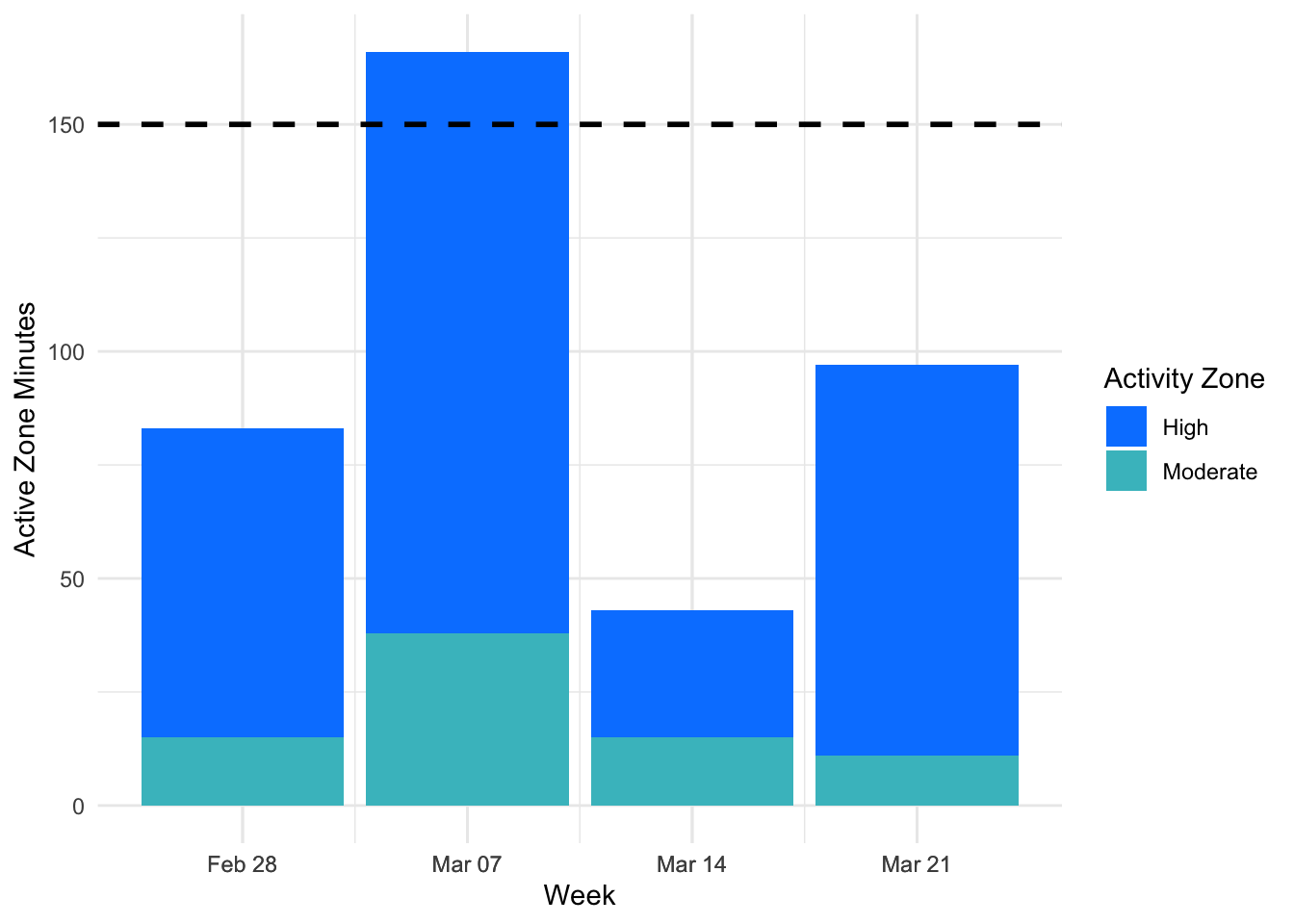
Based on the plot above, it looks like there is a lot of variance in how much exercise I’m getting week to week. Generally, I have also been averaging less than the recommended 150 minutes of activity per week.
Hours of Sleep by Day of Week
Another statistic that I would like a broader overview of is sleep. Similar to exercise, I am less interested in how well I slept for any individual day than I am about how well I’m sleeping on a consistent basis.
# Get data
sleep_df = sleep_stage_summary(start_date = ymd("2022-02-28"),
                               end_date = ymd("2022-03-26"))
# Clean data
## Calculate benchmarks
mean_all_minutes = sleep_df %>%
group_by(date) %>%
summarize(all = sum(minutes)) %>%
ungroup() %>%
pull(all) %>%
mean()
benchmark_deep = data.frame(low = 0.12*mean_all_minutes/60,
high = 0.23*mean_all_minutes/60,
stage = "deep")
benchmark_light = data.frame(low = 0.32*mean_all_minutes/60,
high = 0.68*mean_all_minutes/60,
stage = "light")
benchmark_rem = data.frame(low = 0.15*mean_all_minutes/60,
high = 0.25*mean_all_minutes/60,
stage = "rem")
sleep_df = sleep_df %>%
filter(stage %in% c("deep", "light", "rem"))
## Calculate total time asleep
sleep_df = sleep_df %>%
group_by(date) %>%
group_modify(~ adorn_totals(.x, where = "row"))
## Get weekday
sleep_df = sleep_df %>%
mutate(weekday = wday(date),
weekday_label = wday(date, label = TRUE))# Plot
sleep_df %>%
ggplot(aes(x = weekday, y = minutes/60, color = stage)) +
geom_ribbon(aes(ymin = benchmark_deep$low, ymax = benchmark_deep$high), fill = "#b7ded2", color = "#b7ded2", alpha = 0.1) +
geom_ribbon(aes(ymin = benchmark_light$low, ymax = benchmark_light$high), fill = "#f7c297", color = "#f7c297", alpha = 0.1) +
geom_ribbon(aes(ymin = benchmark_rem$low, ymax = benchmark_rem$high), fill = "#f6a6b2", color = "#f6a6b2", alpha = 0.1) +
geom_hline(color = "black", linetype = "dashed", size = 1, yintercept = 8) +
geom_point() +
geom_smooth(span = 0.5, se = FALSE) +
scale_x_continuous(breaks = sleep_df$weekday,
labels = sleep_df$weekday_label) +
scale_y_continuous(breaks = c(0, 2, 4, 6, 8, 10)) +
scale_color_manual(name = "Sleep Stage",
values = c("#b7ded2", "#f7c297", "#f6a6b2", "#064273"),
labels = c("Deep", "Light", "REM", "Total")) +
labs(x = "Day of Week",
y = "Hours") +
theme_minimal()## `geom_smooth()` using method = 'loess' and formula 'y ~ x'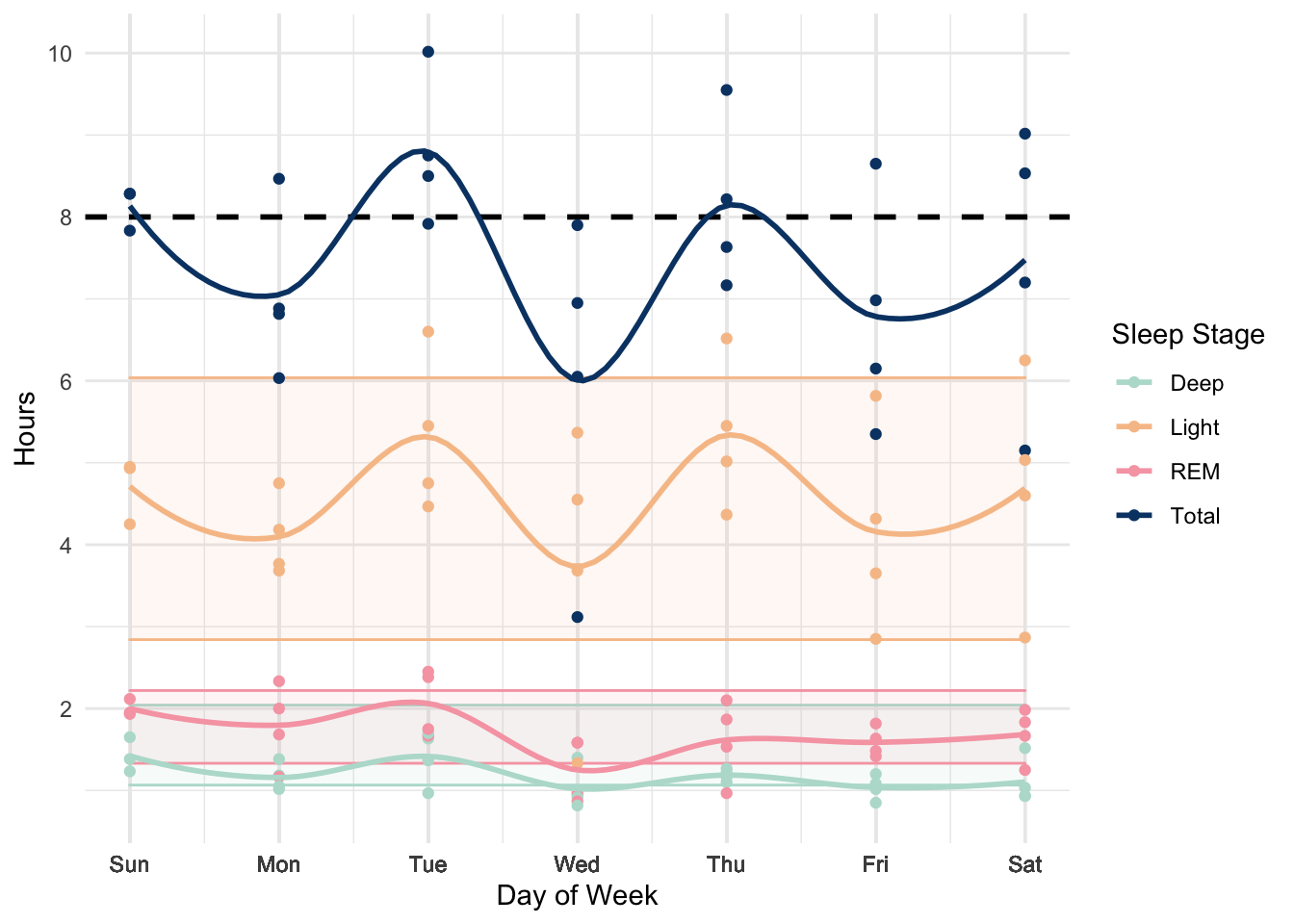
To visualize this, I group my sleep data by day of week (e.g. “Friday” corresponds to the night of sleep from Thursday night to Friday morning). Each point in the plot above corresponds to a separate date and I plot the time I spent in each sleep stage (“deep”, “light”, or “REM”) and my total sleep time (in dark blue). The dashed line corresponds to 8 hours of total sleep and the shaded bands correspond to benchmarks for how much time I should spend in each sleep stage according to Fitbit.
In general, I am averaging between 7 and 8 hours of sleep. There is clearly a lot of variance in how much sleep I’m getting from day to day and between different days of the week, though I would like to track my sleep longer to get a better sense of the strength of the pattern.
These are just a few examples of how you can create alternative visualizations for your Fitbit statistics. I made some plots to help me answer questions I was curious about, but there are potentially many other interesting plots you can explore with your Fitbit data. Using the fitbitr package makes the process of extracting your data in R simple. The package author has also written a blog post showing some other examples of what you can do with the package, which you may be interested in checking out.
Unfortunately, there seems to be a mismatch between the activity levels reported by the API (“lightly active”, “fairly active”, and “very active”) and the activity levels shown in the Fitbit app (“fat burn zone”, “cardio zone”, and “peak zone”), as discussed here. The latter is what the app uses to calculate your Active Zone Minutes, but the former is what is available in the API. This means that currently, there is no easy way to recreate the same calculations for Active Zone Minutes used by the Fitbit app.↩︎