Reordering geom_bar and geom_col by Count or Value
One of the things I’m always looking up with ggplot2 is how to reorder the bars in my bar charts by their length (i.e. the count/frequency or value, depending on whether you’re using geom_bar or geom_col). If you do a Google search, there are multiple different solutions, but I will document in this post what I’ve found to be the cleanest and simplest solution.1
Reordering geom_bar by count
By default, the bars are arranged by the order (levels) of the factor variable.2 For example, below I plot the count (i.e. frequency) of each of the 4 groups (“A”, “B”, “C”, and “D”) and they are arranged in alphabetical order along the x-axis.
suppressPackageStartupMessages({
  library(ggplot2)
  library(dplyr)
})

# Create example dataset
df = data.frame(group = c(rep("A", 4), rep("B", 2), rep("C", 1), rep("D", 3),
                          rep("E", 5), rep("F", 1), rep("G", 1), rep("H", 4)),
                value = sample(1:21))

# Default order
df %>%
  ggplot(aes(x = group)) +
  geom_bar()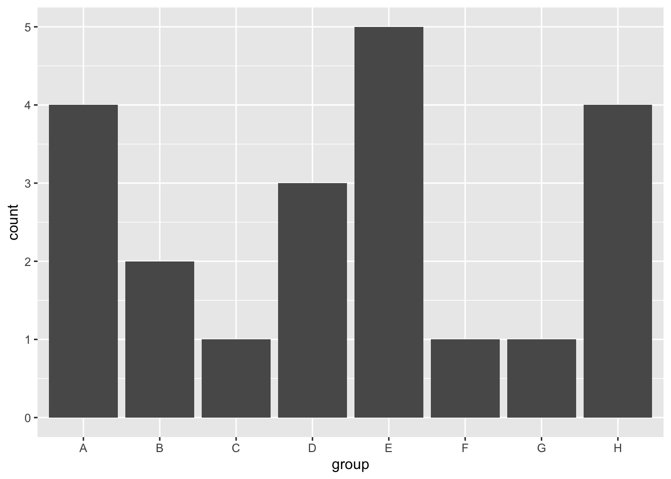
To reorder the bars by their length, I will use the forcats package. For geom_bar, the length of the bar reflects the frequency of the group, so we need to reorder the levels of our factor variable by their frequency. This can be done using the fct_infreq function.
library(forcats)

# Highest frequency to lowest frequency
df %>%
  ggplot(aes(x = fct_infreq(group))) +
  geom_bar() +
  labs(x = "group")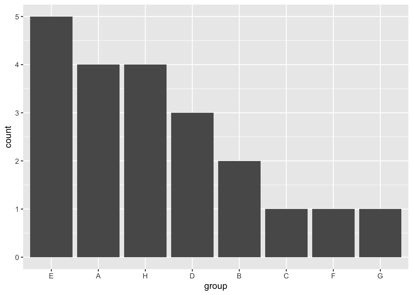
To reverse the order, use fct_rev.
# Lowest frequency to highest frequency
df %>%
  ggplot(aes(x = fct_rev(fct_infreq(group)))) +
  geom_bar() +
  labs(x = "group")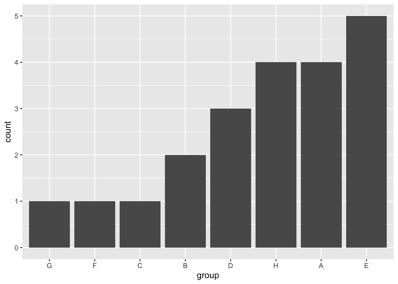
Reordering geom_col by value
For geom_col, the lengths of the bars correspond to values for each group, so we need to reorder the factor levels by that value. Using the same example dataset, let’s say we calculate the mean value for every group and plot the corresponding bar chart with geom_col. To order by the length of the bar, we can use the fct_reorder function from the forcats package. For fct_reorder, we need to tell the function our factor variable (“group”) and the values we want to reorder it by (the column corresponding to the y-axis, i.e. “value”).
library(forcats)

df_means = df %>%
  group_by(group) %>%
  summarize(value = mean(value))

df_means %>%
  ggplot(aes(x = fct_reorder(group, value), y = value)) +
  geom_col() +
  labs(x = "group")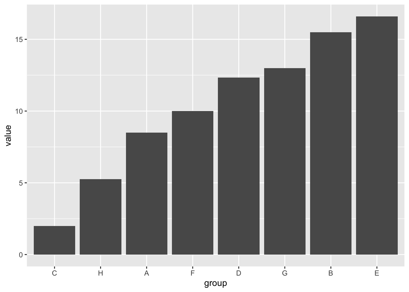
If we want to reverse the order to be descending, we can again use the fct_rev function.
df_means %>%
  ggplot(aes(x = fct_rev(fct_reorder(group, value)), y = value)) +
  geom_col() +
  labs(x = "group")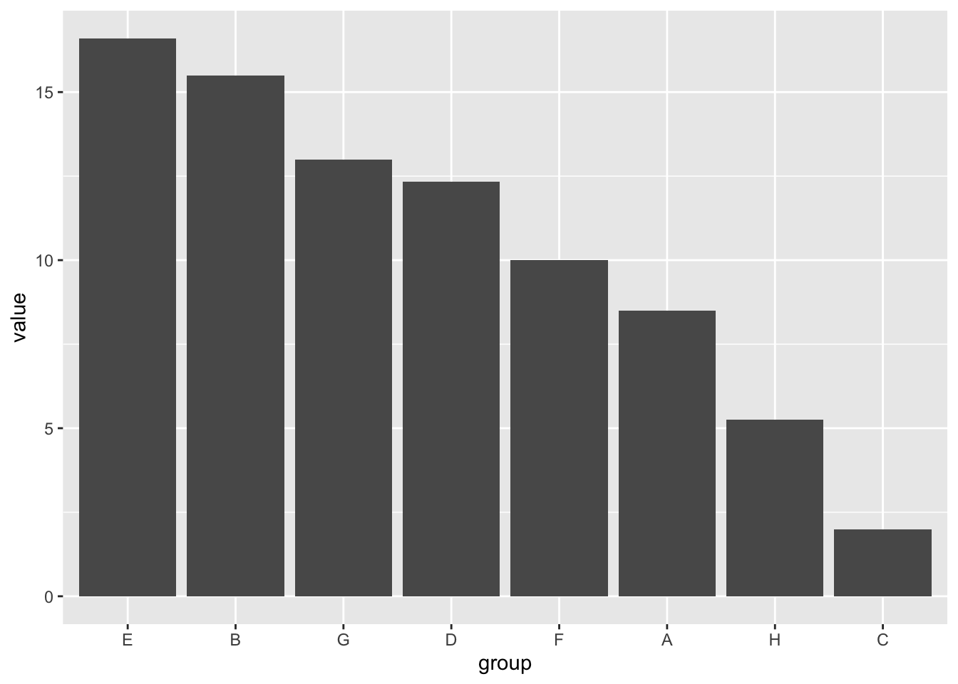
Bonus Tips with the forcats Package
Manually set levels of a factor
Instead of using the fct_infreq or fct_reorder functions to set the order of the levels according to the frequency or value, you can also manually determine the order of factor levels yourself. I can’t say that this is something I’ve had to do often, but I will document it here just in case it is helpful.
In the forcats package, the function to manually reorder the levels is fct_relevel. One neat thing is that you don’t have to specify all the levels in your reordering, but can move one or more levels individually to a specified position, as shown in the examples below.
df %>%
  ggplot(aes(x = fct_relevel(group, "D"))) + # Move "D" group to the front
  geom_bar() +
  labs(x = "group")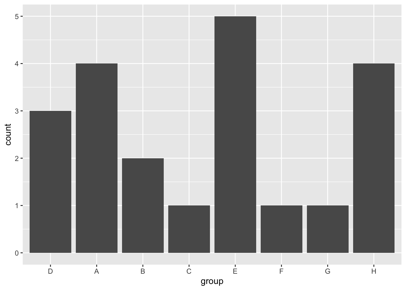
df %>%
  ggplot(aes(x = fct_relevel(group, c("A", "D"), after = 4))) + # Move "A" and "D" groups to fifth place
  geom_bar() +
  labs(x = "group")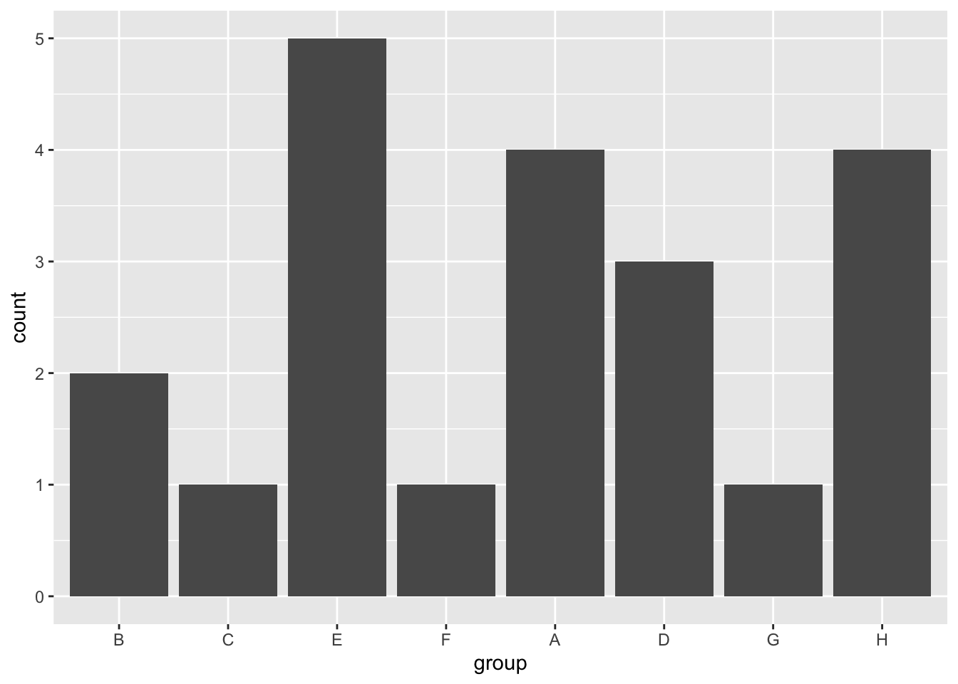
Lump Infrequent Categories Together
The forcats package also offers useful functions to lump infrequent categories (levels) in your factor variable together. For example, using the fct_lump_n function, we can keep only the n most frequent categories and lump the rest of them into a category named “Other.”
Similar functions also exist to lump the categories under different criteria (e.g. fct_lump_min, fct_lump_prop, fct_lump_lowfreq).
df %>%
  ggplot(aes(x = fct_lump_n(fct_infreq(group), n = 5))) + # Only keep the 5 most frequent categories and lump the rest into "Other"
  geom_bar() +
  labs(x = "group")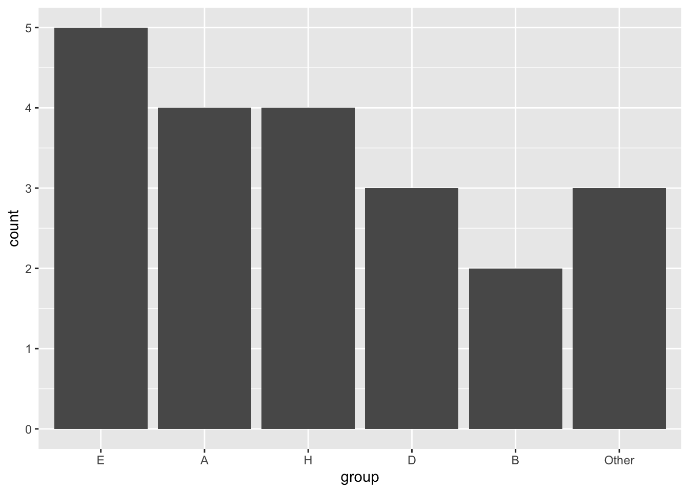
# Highlight "Other" category
df %>%
  mutate(group = fct_lump_n(fct_infreq(group), n = 5), # Only keep the 5 most frequent categories and lump the rest into "Other"
         highlight = fct_other(group, keep = "Other", other_level = "Top N Groups")) %>% # Create a factor variable with two levels to use as fill/highlight
  ggplot(aes(x = group, fill = highlight)) +
  geom_bar()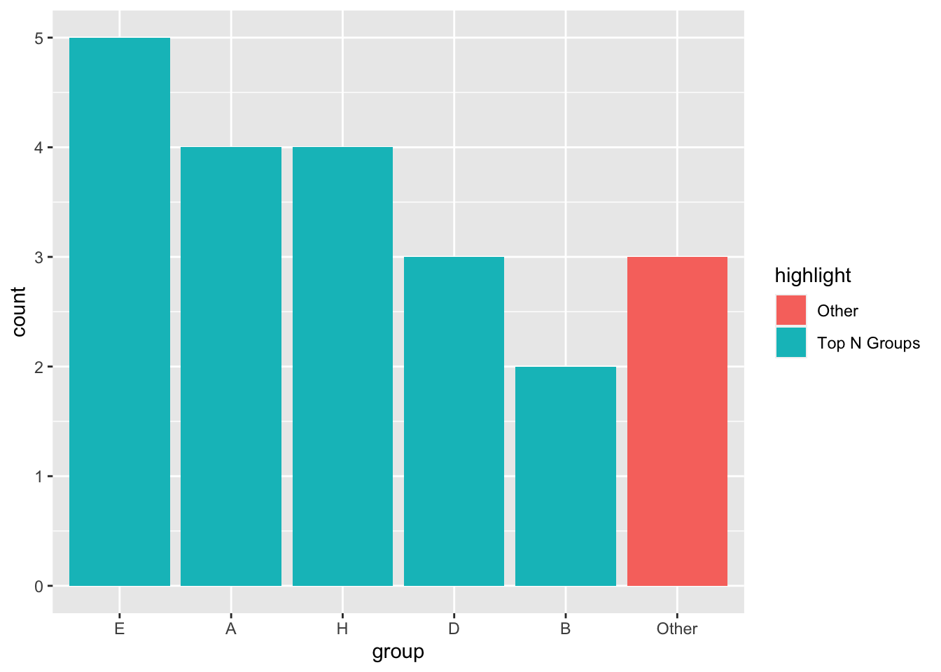
For more about the forcats package, check out their documentation here.
Credit goes to Clause Wilke for sharing his slides, which is primarily what I’ve based this post on.↩︎
Technically, the group variable I use in my example dataset is of type “character,” but
ggplot2appears to automatically convert it to a factor variable with levels following an alphabetical order.↩︎