Probability of Winning an NBA Game: A Minute-by-Minute Breakdown
Your NBA team is down 17 points and there are only 8 minutes left in the game. What is the probability that they pull a comeback and win the game?
It’s possible to answer this using historical data (i.e. in the past, how many teams have won after being in this situation). Given that sports commentators love to provide super specific, seemingly arbitrary statistics (e.g. no team has won Game 7 of an ECF after losing Game 6 by more than 10 points), I knew that I should be able to access the relevant data somewhere and calculate these probabilities.
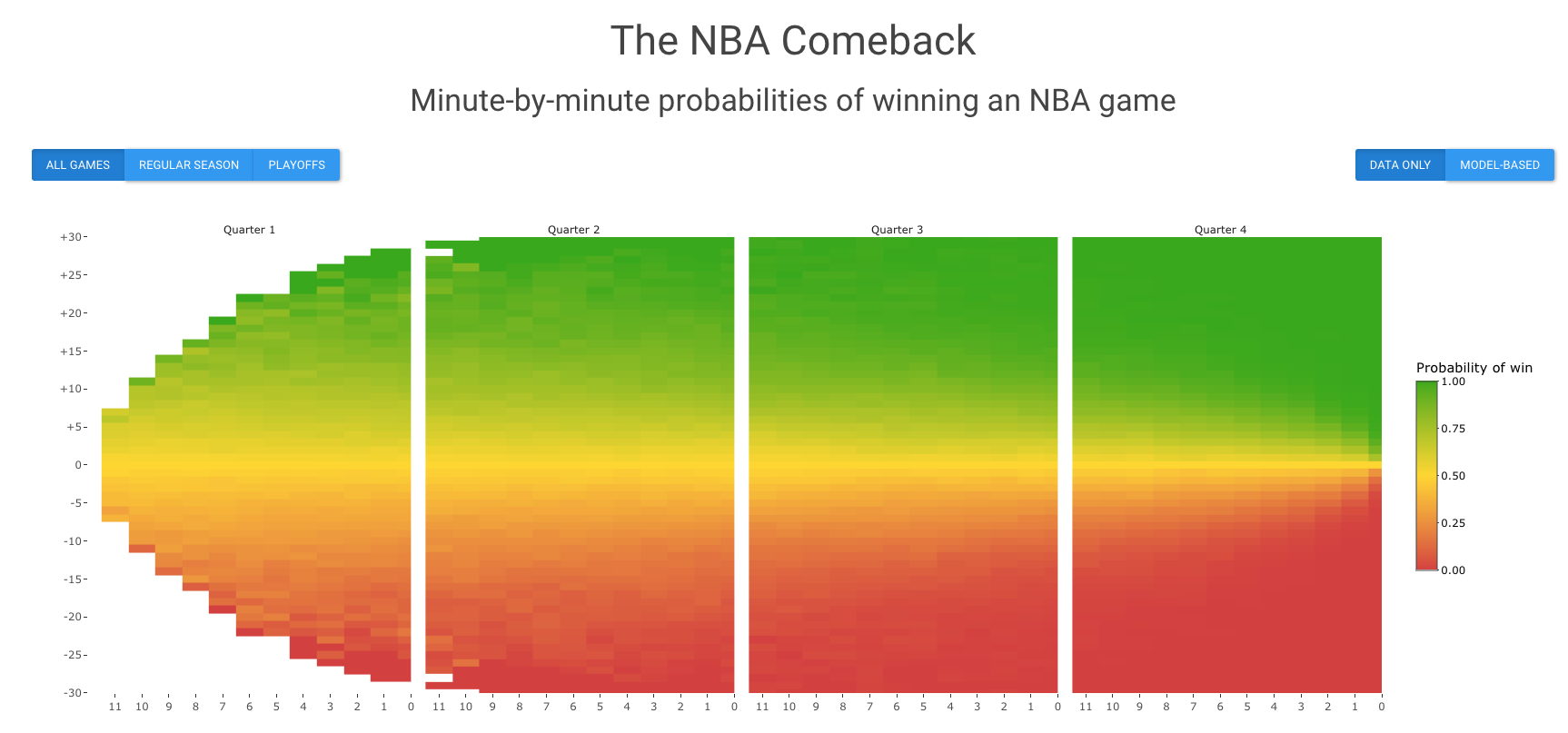
tl;dr: I did this analysis! Below is a screenshot of the Shiny app I made, which gives a minute by minute breakdown of the probability of winning when facing a score margin of Y points with X minutes left in the game:
For an overview of how I did my analysis, keep reading. Code is available on github.
Data
NBA API/Web Scraping
To download the data, I used the nba_api Python package.1 There are essentially two steps: 1) download game IDs and 2) download play-by-play data for every game ID.
First, I access the game IDs for every game from 2000-2020.2 Below is an example for accessing the game IDs for the 2019-20 NBA regular season. Looping this over all seasons and season types (regular season and playoffs), I can get all the game IDs.
Note that I filter the game IDs to only NBA teams, because some of the game IDs are for WNBA teams. In addition, if you are requesting multiple times from the API, you need to add a delay between requests of about 0.5 seconds (using time.sleep(0.5)).3 Otherwise, you will get temporarily blocked from requesting.
# Get NBA team IDs
from nba_api.stats.static import teams
nba_teams = teams.get_teams()
nba_team_ids = [team["id"] for team in nba_teams]

from nba_api.stats.endpoints import leaguegamefinder
from nba_api.stats.library.parameters import SeasonType
# Game finder for season and season type
gamefinder = leaguegamefinder.LeagueGameFinder(season_nullable = "2019-20",
    season_type_nullable = SeasonType.regular, timeout = 10)

# Extract game IDs
games_dict = gamefinder.get_normalized_dict()
games = games_dict["LeagueGameFinderResults"]
game_ids = [game["GAME_ID"] for game in games if game["TEAM_ID"] in nba_team_ids] # filter to nba teams only

# Print game IDs
print(game_ids[1:10])
## ['0021901315', '0021901315', '0021901317', '0021901318', '0021901318', '0021901316', '0021901316', '0021901310', '0021901309']Now once you have the game IDs, you can access the play-by-play data for each game. The play-by-play refers to the table that looks like this, so there is information not only about all the shots that were made, but also other plays like blocks, rebounds, etc. down to the second. In the code chunk below, I show how to download the play-by-play, remove non-scoring rows, and clean up the columns a bit for one game ID. Again, you want to loop this over all your game IDs, making sure to add a 0.5 second time delay between requests. There are about 27,000 games in total from 2000-2020, so it took me about 4-5 hours to download the play-by-play for all the games sequentially on my local computer.
from nba_api.stats.endpoints import playbyplay
game_id = game_ids[1]
df = playbyplay.PlayByPlay(game_id).get_data_frames()[0]

# Select rows with scores
df = df.loc[df["SCORE"].notnull()]

# Clean up columns
df[["minute", "second"]] = df["PCTIMESTRING"].str.split(":", expand = True).astype(int)
df[["left_score", "right_score"]] = df["SCORE"].str.split(" - ", expand = True).astype(int)
df.rename(columns = {"PERIOD":"period"}, inplace = True)
df = df.loc[:, ["period", "minute", "second", "left_score", "right_score"]]

print(df)
## period minute second left_score right_score
## 5 1 11 22 0 2
## 7 1 11 22 0 3
## 8 1 11 8 2 3
## 11 1 10 37 5 3
## 12 1 10 19 5 6
## .. ... ... ... ... ...
## 402 4 1 46 132 94
## 410 4 0 51 134 94
## 416 4 0 18 134 95
## 417 4 0 18 134 96
## 418 4 0 0 134 96
##
## [123 rows x 5 columns]Now we have the data, so we’re basically done!4 As a side note, I just want to mention that using the NBA API was not what I initially tried. Originally, I tried to scrape the data from the ESPN website. This was actually fairly simple to do for one game. I used the R package rvest and SelectorGadget to scrape the relevant columns.
library(pacman)
p_load(dplyr, rvest)

webpage <- read_html("https://www.espn.com/nba/playbyplay?gameId=401248438")
times = webpage %>%
  html_nodes(".time-stamp") %>%
  html_text()

scores = webpage %>%
  html_nodes(".combined-score") %>%
  html_text()

tibble(times = times,
       scores = scores)
## # A tibble: 449 x 2
## times scores
## <chr> <chr>
## 1 12:00 0 - 0
## 2 11:48 2 - 0
## 3 11:25 2 - 2
## 4 11:11 2 - 2
## 5 11:10 2 - 2
## 6 11:02 2 - 2
## 7 11:01 2 - 2
## 8 10:53 2 - 2
## 9 10:52 2 - 2
## 10 10:39 2 - 2
## # … with 439 more rowsThe tricky part was that I needed to know the “game ID” for every game in order to pass the correct URL to read_html. So while I was searching for a solution, I came across the NBA API Python package and ended up using that. But if you already know the URL/game ID and only want to download the play-by-play for that one game, scraping the webpage is straightforward to do as well.
Data Cleaning
After downloading the data, I clean up the data a bit. I do most of my data cleaning in R, but it’s easy to integrate the Python functions I used to download the data earlier with my R code using the reticulate R package. Using reticulate::source_python, I can source the Python functions into R and use them like regular R functions.
I’ll just quickly describe what my data cleaning steps were below, but the functions I wrote to clean the data are here.
- Note that there is an inherent symmetry in the data. That is, if a team is down 5 points, then equivalently the other team is up 5 points. As a result, if the probability that a team wins a game when they are down \(Y\) points with \(X\) minutes left is \(p_{xy}\), then the probability that a team wins a game when they are up \(Y\) points with \(X\) minutes left is \(1-p_{xy}\). Therefore, I only need to calculate the probabilities for half of the scenarios. It also implies that if the score is tied at any point during the game, the probability that either team wins must be \(0.5\), so I can drop all the rows in the play-by-play where the score is tied.
- In the play-by-play data, they repeat a row for the score at the beginning and end of each quarter, so I remove those rows to avoid double counting.
- For every row in the play-by-play data, I add a column representing whether the team that was behind ended up winning.
- I merge overtime probabilities into the 4th quarter. Each overtime period is 5 minutes, so I’m assuming that each 5 minute overtime period can be aggregated into the last 5 minutes of the 4th quarter. This is primarily for the purpose of a simpler visualization.
- I summarize the proportion of times a team ended up winning the game over each minute of the game and score margin. This is the empirical estimate of the probability.
- I went back and forth a few times on how to define the “minute.” If there are 11:45 seconds left in the game, should I say there are 12 minutes left or 11 minutes left? There are advantages to both, but in the end, I went with 11 minutes. I figured that if I was watching a game, it’s easier for me to look up the probabilities by just taking the number of the minute, rather than taking the additional step of rounding it.
In the end, I get a data frame that looks like the following. Every row corresponds to the time left down to the nearest minute (quarter/minute), the score margin (diff), the empirical probability that the team ended up winning based on the historical proportion (prob_win), and the sample size, i.e the number of games where a team has faced this score margin at the specified time (n).
## # A tibble: 3,380 x 5
##    quarter minute  diff prob_win     n
##    <fct>    <dbl> <dbl>    <dbl> <int>
##  1 1            0   -26   0          1
##  2 1            0   -25   0          1
##  3 1            0   -24   0          2
##  4 1            0   -23   0          5
##  5 1            0   -22   0.143     14
##  6 1            0   -21   0.0667    15
##  7 1            0   -20   0.111     27
##  8 1            0   -19   0.0714    28
##  9 1            0   -18   0.0976    41
## 10 1            0   -17   0.0938    64
## # … with 3,370 more rows
Analysis
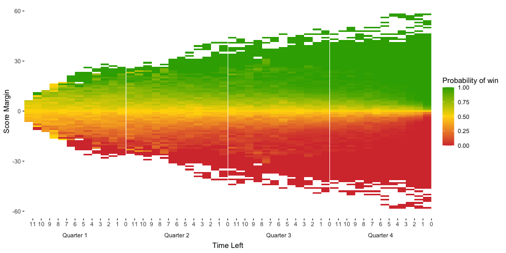
Empirical Probabilities
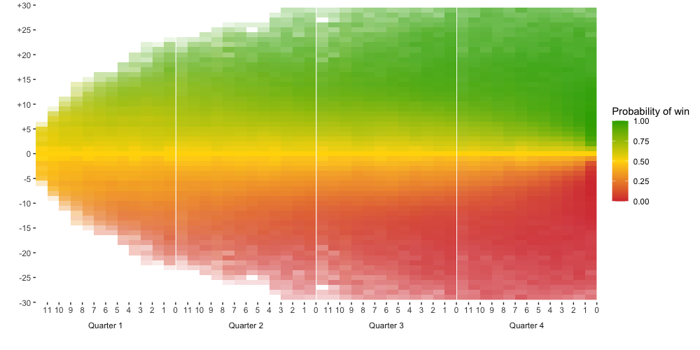
To display the empirical probabilities, I make a heatmap, where the time left is on the x-axis and the score margin is on the y-axis. The function I wrote for plotting the data can be viewed here. Each tile in the heatmap corresponds to a different row in the data frame. For the playoff games, the heatmap looks like the following.
I make a couple of further adjustments to the plot:
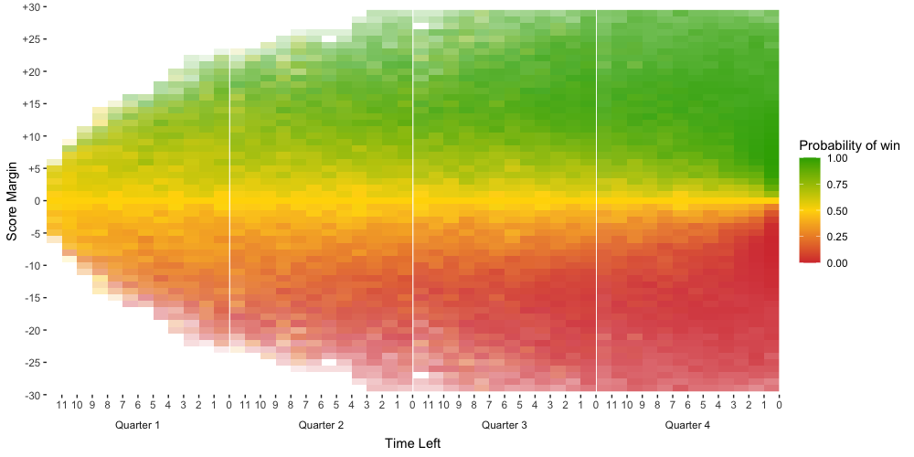
- Limit the y-axis to a score margin within +/- 30. Outside of this range, the outcome is pretty much guaranteed and it’s rare to see such a large score margin anyway. Therefore, including the region beyond this range is not very useful.
- Only plot tiles that have at least a sample size of 5. Recall that the empirical probability is just the proportion of cases that have resulted in the team winning, so when the sample size is small, it’s not really a reliable number.
- Weigh the transparency of each tile by the sample size. Unfortunately, this effect doesn’t carry over when I use
ggplotlyto make the heatmap interactive, so you won’t see it in the Shiny app. I assume this will be fixed at some point by the package developers. In the meantime, the hover text for the plots on the Shiny app does list the sample size.
After making these adjustments, I get the following plot.
Nonparametric Smoothing
In the above heatmaps, notice that the empirical probabilities are a bit noisy. We can smooth out the data by applying a series of nonparametric fits. In addition, we can use our knowledge that the trends in both the x and y-direction must be monotonic. In the x-direction, given a fixed score margin, say of -5, the probability of winning the game should monotonically decrease as the time left decreases. In the y-direction, given a fixed time, say of 5 minutes left, the probability of winning the game should monotonically decrease the greater the score margin (in the negative direction) is.
To obtain a nonparametric monotonic fit, I use the smooth.monotone function from fda and weigh the points by the sample size. Below is an example for the case when the score margin = -5. Essentially, I’m fitting a smooth curve to the empirical probabilities on the heatmap for the row of tiles corresponding to a score margin of -5.
p_load(fda, ggplot2)

df = games_playoffs_summ %>%
  mutate(time_left = (4-as.numeric(quarter))*12 + minute) %>%
  filter(diff == -5) %>%
  arrange(time_left)

tmp = df
x = tmp$time_left
y = tmp$prob_win
rng = c(min(x), max(x)) # range of x

# b-spline basis
norder = 6
n = length(x)
nbasis = n + norder - 2
wbasis = create.bspline.basis(rng, nbasis, norder, x)

# starting values for coefficient
cvec0 = matrix(0, nbasis, 1)
Wfd0 = fd(cvec0, wbasis)

# set up functional parameter object
Lfdobj = 3          #  penalize curvature of acceleration
lambda = 10^(-0.5)  #  smoothing parameter
growfdPar = fdPar(Wfd0, Lfdobj, lambda)
wgt = tmp$n         # weight vector = sample size

# smoothed result
result = smooth.monotone(x, y, growfdPar, wgt, conv = 0.1)
##
## Results
##
## Iter. PENSSE Grad Length Intercept Slope
## 0 0.7421 0.1397 0.1513 0.0065
## 1 0.3155 0.0269 0.0848 0.005
## 2 0.192 0.0206 0.0147 0.0043# coefficients
Wfd = result$Wfdobj
beta = result$beta
y_smooth = beta[1] + beta[2]*eval.monfd(x, Wfd)
y_smooth = sapply(y_smooth, function(y) ifelse(y > 0.5, 0.5, y))
y_smooth = sapply(y_smooth, function(y) ifelse(y < 0, 0, y))
# save smoothed line
df = df %>%
mutate(prob_win_smooth_time = y_smooth)
df %>%
ggplot(aes(x = time_left, y = prob_win)) +
geom_point() +
geom_line(aes(y = y_smooth)) +
labs(title = "Score margin = -5") +
theme_bw()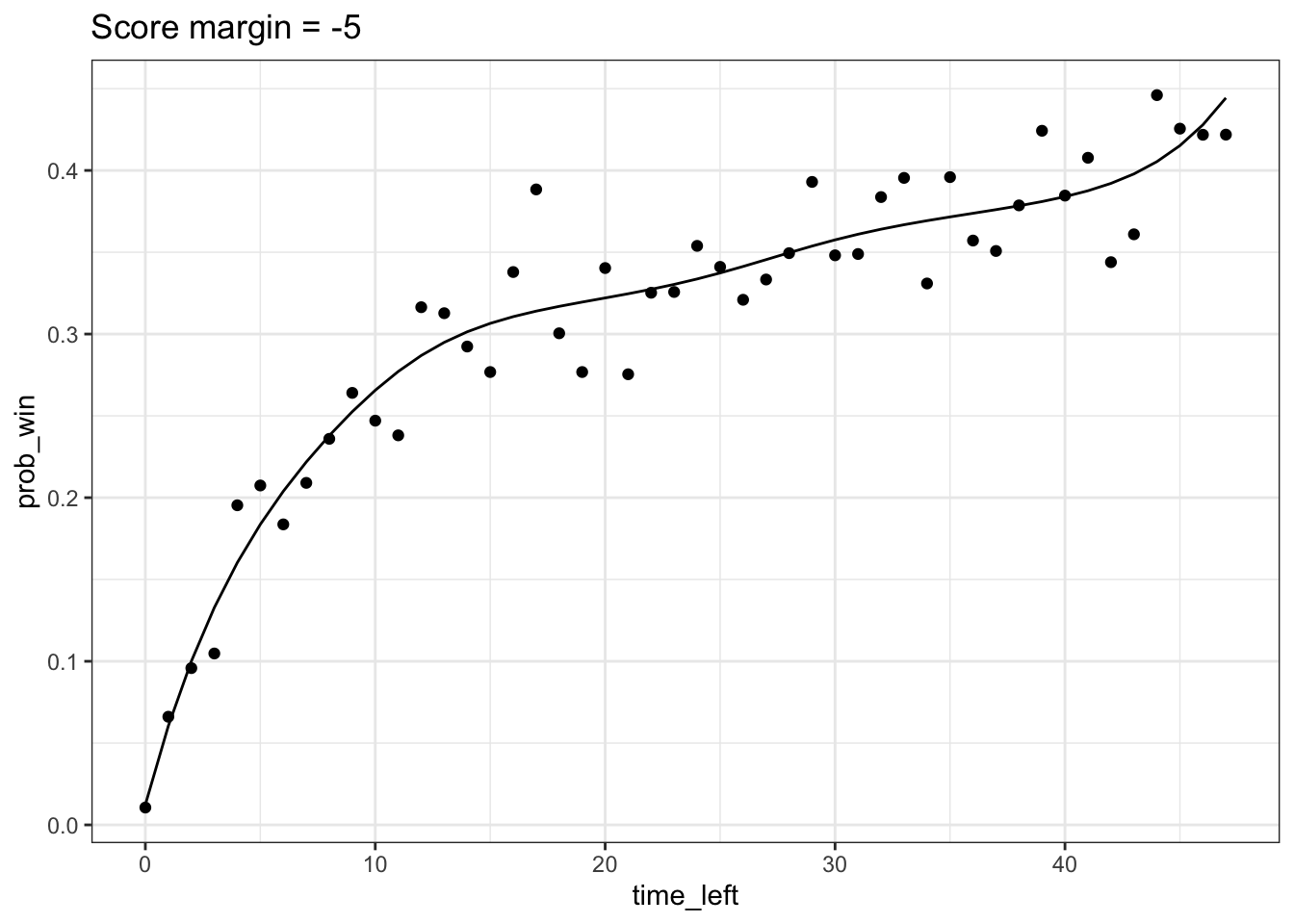
Applying this smoothing procedure over every row and column in our heatmap with dplyr::group_modify, we get two fitted values for each tile. One is from the nonparametric line obtained by fitting a line in the x-direction and another is from the nonparametric line obtained by fitting a line in the y-direction. I take the average of these two values to obtain the smoothed probability. I imagine that there are ways to monotonically smooth the data in both the x and y-direction simultaneously, but this seems to work fairly well already by eye.5 The resulting heatmap of the smoothed probabilities is shown below.
Binomial Probabilities
This is a section that you can skip because it didn’t end up working, but I’m writing about it in case I want to revisit the idea in the future.
So before I had finished downloading and cleaning the data, I thought about modeling the probabilities using a binomial distribution, because I was concerned that the data would be lot sparser and noisier than it ended up being. The idea is the following:
Say your team is down \(z=5\) points and there are 30 minutes left in the game. Assume that given 30 minutes, we know that there are \(n\) more points to be scored. Then the number of points your team will score in the remaining time is \(X \sim Binom(n, p)\) and the number of points the opposing team will score is \(Y \sim Binom(n, 1-p)\), with the constraint that \(X+Y = n\). If \(X-Y > 0\), then your team wins. In other words, we need to find \(P(X > (n+z)/2)\).
Suppose for now that \(p = 0.5\), so I assume both teams are equally matched,6 and that I take \(n\) to be the average number of points left to be scored given that there are \(x\) minutes left in the game. Below is the result for a score margin = -5.
model_prob = function(x, diff){
  score_margin = abs(diff)
  n = games_playoffs_npoints %>%  # number of scoring plays left
    filter(time_left == x) %>%
    pull(n_points_left) %>%
    floor()

  p = 0.5 # probability scoring on each play of losing team

  # X ~ Binom(n, p) # the number of points losing team will score in remaining time
  # Y ~ Binom(n, 1 - p) # the number of points winning team will score in remaining time
  p_win = 0 # Probability of winning the game
  if(n >= score_margin/2){
    # Probability of winning in regulation
    p_win = p_win + (1 - pbinom(floor((n + score_margin)/2), n, p))

    # Probability of winning in overtime
    if((n + score_margin) %% 2 == 0){
      p_tie = dbinom((n + score_margin)/2, n, p)
    } else {
      p_tie = 0
    }
    p_win_overtime = p_tie*0.5 # In the event of a tie at regulation, assume teams are equally matched, so conditional probability of winning in overtime is 0.5

    p_win = p_win + p_win_overtime
  } else {
    p_win = 0
  }
  return(p_win)
}

df$y_model = sapply(df$time_left, function(x) model_prob(x, -5))
df %>%
  ggplot(aes(x = time_left, y = prob_win)) +
  geom_point() +
  geom_line(aes(y = y_smooth)) +
  geom_line(aes(y = y_model), color = "#005b96") +
  labs(title = "Score margin = -5") +
  theme_bw()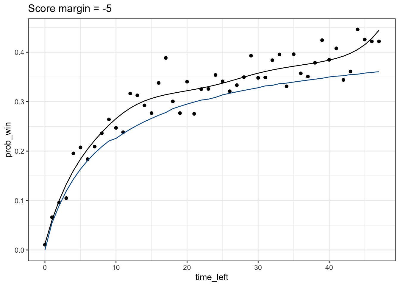
It turns out that the probability I obtain from the binomial distribution is actually systematically lower than the actual empirical probabilities (blue line is the binomial probability, black line is the nonparametric fit), particularly when there are still many minutes left in the game. This is pretty interesting because it means that teams that are behind have, historically, a higher chance of winning the game than if we assume that every point from now on has an equal probability of being won by either team. We can think about why that is. But it also means that the binomial distribution isn’t a great fit to the data, so I didn’t try to incorporate this into the Shiny app.
Shiny App
I package my plots for presentation into a Shiny app, which allows you to choose between displaying the probabilities for all games, regular season games, or playoff games and whether you want to see empirical probabilities or the smoothed nonparametric fits (what I call “model-based” on the app). Hovering over each tile also displays relevant information.
I think what would be pretty cool is if the Shiny app could self-update whenever a new NBA game is played. I wrote some of my code for downloading the data with this in mind. However, I’ll have to think about how to make it more feasible. One problem is that it takes a few minutes to clean the data and calculate the smoothed probabilities right now, which I think isn’t fast enough to reasonably expect someone to wait on while using the app.
Conveniently, they have a useful short guide for how to download the play-by-play, which taught me most of what I needed to know.↩︎
I start in the 2000-01 season because I was concerned that the game may have changed more the farther back you go. In addition, it saves me some time not having to download more games.↩︎
The nba_api folks have a Slack channel, linked on their github README that you can join to ask questions. It’s where I learned that 0.5 seconds is probably the quickest request frequency you can do.↩︎
Only half-kidding.↩︎
This process reminds me of image processing tools, which makes me wonder what algorithms are used in software like Photoshop.↩︎
You would think that the actual \(p\) is lower, that is, the team that is behind is less likely to win the next point than the opposing team. If so, we can think about estimating \(p\) using a Bayes estimator, as described here.↩︎