What is the Effect of Increasing Voter Turnout in the U.S.?
On campaign trails across the U.S., the same message is often repeated: vote! Their goal is to encourage more people to vote, especially the people who are likely to vote for them. But which party benefits more from increasing overall voter turnout? The conventional wisdom today is that it benefits the Democratic party more than the Republican party. This is based on the working knowledge that young people of color are believed to have lower voting turnouts and are also more likely to vote for Democratic candidates. Therefore, it’s reasonable to hypothesize that increasing voting turnout would lead to more votes for the Democratic party.
I was interested, however, in actually quantifying how big this effect is. If everyone voted, what would be the election results on a state-by-state basis? To my surprise, I couldn’t find this information online, so I decided to do my own analysis.1
Results
tl;dr: Increasing voter turnout does in fact benefit the Democratic party. But the effect is smaller than I expected.
Below, I’ve plotted the actual 2016 presidential election results (dark blue points) versus what the election results might have looked like if everyone had voted (light blue points).

Panel (a) is for all states2 and panel (b) is the same plot showing only “swing” states, which are particularly important in the election due to how the U.S. electoral college works. The GOP vote percentage (x-axis) is the share of votes won by the GOP candidate (Donald Trump) out of all votes cast for either the GOP or Democratic candidate.
Based on my analysis, four states would have flipped from Republican to Democrat: Michigan, Wisconsin, Pennsylvania, and Florida. This is a difference of 75 electoral votes, which would have been more than enough to elect the Democratic candidate, Hillary Clinton, instead of Donald Trump (only 37 electoral votes are needed). But this is assuming that everyone voted. It’s much more likely that any voluntary increase in turnout would be far more modest. Since 1960, the voter turnout rate has ranged from 49% to 63% (Data source #8). In 2016, it was 56%. If we assume that the overall voter turnout only increases by roughly 10%, then only Michigan could have plausibly flipped and Trump would have still won the election.
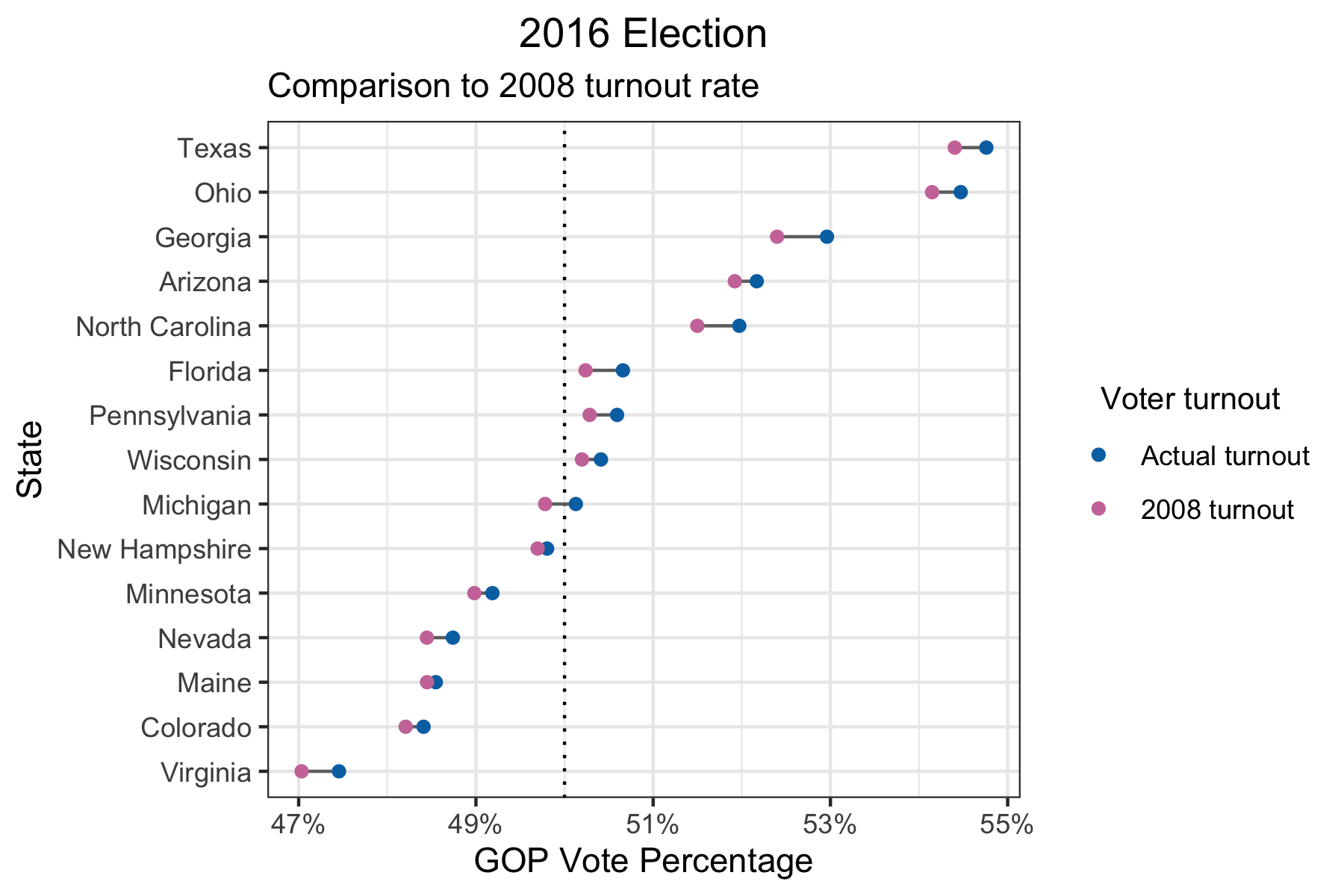
It’s true that political candidates may succeed in increasing voter turnout specifically among voters more favorable to them. In fact, this was what happened in 2008 for Barack Obama, the first black president to be elected in the U.S. In 2008, the black vote turnout was about 10% higher compared to 2016, while it was only 1-2% higher for other racial groups: Non-Hispanic White, Hispanic White, and Asian (Data sources #2, 5). However, even if we use the voter turnout rates from 2008, it’s still the case that only Michigan would have flipped.
Having said that, no one knows how tight the margins will be for every new election. If more states end up looking like Michigan in the upcoming 2020 election, how high the voter turnout is could be a deciding factor. For example, there is evidence that the changing demographics in the U.S. are favorable to the Democratic party. If we take the party preferences and turnout of 2016 and the demographics of 2019, we would see the following results for the swing states.
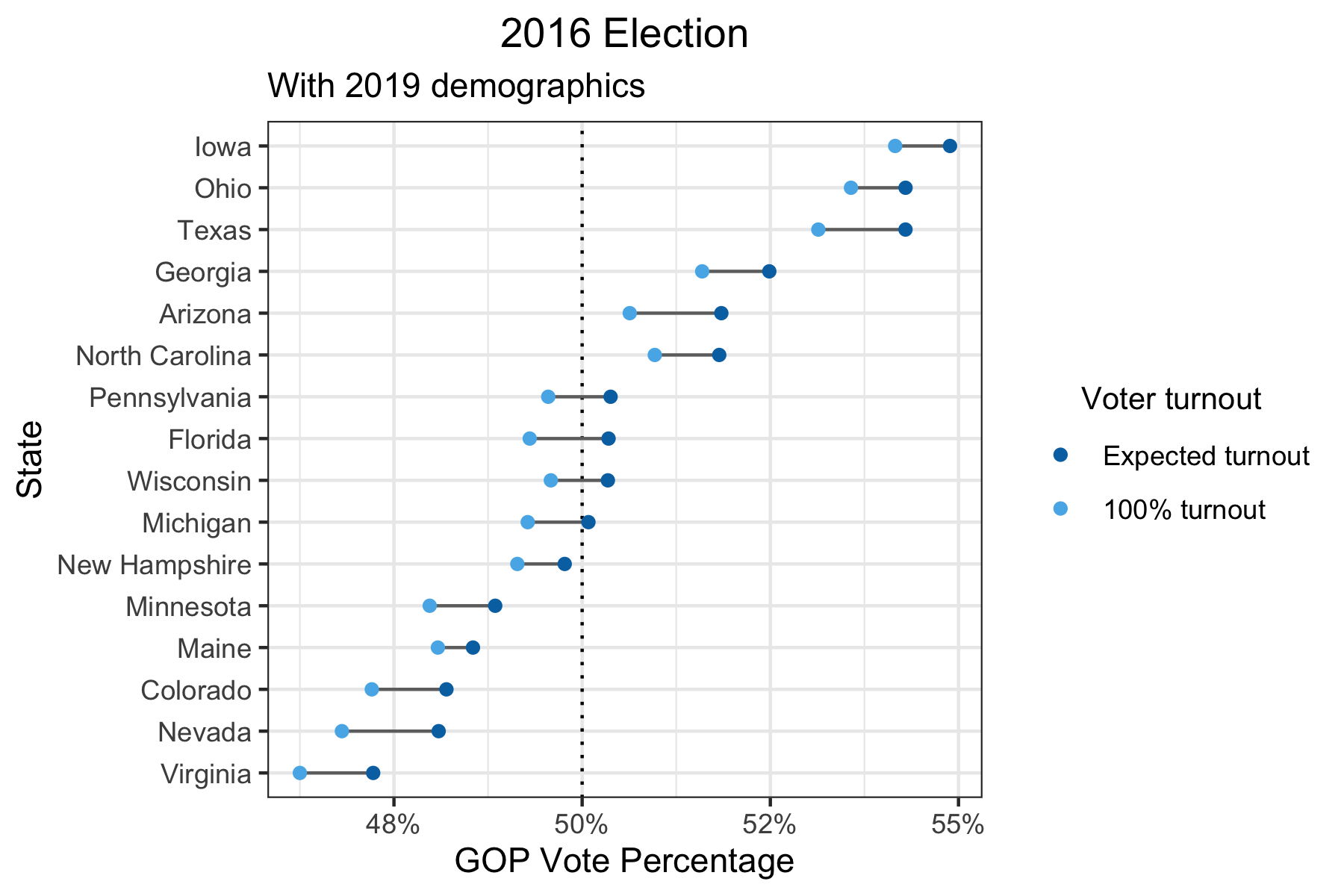
Wisconsin, Florida, and Pennsylvania are now predicted to have vote percentages closer to the boundary of 50% and it’s more likely that increasing voter turnout might flip those states from Republican to Democrat.
In summary, I think that it’s unlikely that any reasonable increase in voter turnout would have changed the 2016 presidential election results. However, that doesn’t mean it won’t make a difference in the 2020 presidential election.
Analysis details
If you’re interested in how I did my analysis, keep reading. I walk through my approach step-by-step.
Party preference and turnout by demographic groups
To understand how increasing the voter turnout may affect the election, I collected data on two things: the estimated turnout rate (i.e. What % of a demographic group voted?) and the party preference (i.e. What is the ratio of Republican vs Democratic votes for a demographic group?). The idea is that if both the turnout rates and party preferences differ between demographic groups, then increasing the voter turnout can shift the election outcome. I looked at 3 demographic variables: sex, age, and race.
# Sex
sex_tb = tibble(sex = c("Male", "Female"),
                party_pref_sex = c(52/41, 39/54), # Data source #1
                turnout_sex = c(0.593, 0.633)) # Data source #3

# Age
age_tb = tibble(age = c("18-29", "30-49", "50-64", "65+"),
                party_pref_age = c(28/58, 40/51, 51/45, 53/44), # Data source #1
                turnout_age = c(0.434, 0.569, 0.662, 0.714)) # Data source #2 (Note: age groups are different: 18-29, 30-44, 45-59, 60+)

# Race
race_tb = tibble(race = c("White", "Black", "Hispanic", "Asian"),
                 party_pref_race = c(54/39, 6/91, 28/66, 23/65), # Data sources #1, #6
                 turnout_race = c(0.647, 0.599, 0.449, 0.339)) # Data sources #2, #5

# 2008 turnouts
sex_tb_2008 = tibble(sex = c("Male", "Female"),
                     turnout_sex_2008 = c(0.615, 0.656)) # Data source #3
age_tb_2008 = tibble(age = c("18-29", "30-49", "50-64", "65+"),
                     turnout_age_2008 = c(0.484, 0.607, 0.695, 0.710)) # Data source #2 (Note: age groups are different: 18-29, 30-44, 45-59, 60+)
race_tb_2008 = tibble(race = c("White", "Black", "Hispanic", "Asian"),
                      turnout_race_2008 = c(0.652, 0.691, 0.465, 0.321)) # Data sources #2, #5
Now using this information (party preference and turnout rate by demographic group) along with state-level demographic data, what I can do is calculate the expected party preference for each state based solely on its demographics. As a simplified example, if a state’s population consisted of two subgroups A and B, then the state’s party preference would be equal to mean(population of A*turnout of A*party preference of A, population of B*turnout of B*party preference of B). In other words, it is a weighted mean of the party preferences for each subgroup, where the weight is equal to the population*turnout for each subgroup.
As it turns out, this gives me unrealistic results – what ends up happening is that states with larger white populations skew Republican and states with a larger minority populations skew Democratic. But this isn’t necessarily what happens in reality. Some states like Vermont have predominantly white populations but tend to vote Democrat, while other states like Mississippi have much lower white populations but tend to vote Republican. There are many factors that can contribute to this, such as historical party preferences by regions or states, differences between states in terms of the urban versus rural makeup, and differences in other demographic factors like income and college education that have not been accounted for.
# Demographics by state
demog_raw = read_csv("../../csv/sc-est2019-alldata5.csv", col_types = cols()) # Data source #4
demog = demog_raw %>%
  clean_names() %>%
  filter(age >= 18) %>%
  mutate(sex = case_when(sex == 1 ~ "Male",
                         sex == 2 ~ "Female"),
         race = case_when(race == 1 & origin == 1 ~ "White",
                          race == 2 ~ "Black",
                          race == 1 & origin == 2 ~ "Hispanic",
                          race == 4 ~ "Asian"),
         age = case_when(age >= 18 & age <= 29 ~ "18-29",
                         age >= 30 & age <= 49 ~ "30-49",
                         age >= 50 & age <= 64 ~ "50-64",
                         age >= 65 ~ "65+")) %>%
  filter(!is.na(sex) & !is.na(race) & !is.na(age)) %>%
  select(state, name, sex, race, age, popestimate2016, popestimate2019)
# Calculate overall turnout and party preference for each sex/age/race group by state
dt_demog_state = demog %>%
left_join(sex_tb, by = "sex") %>%
left_join(age_tb, by = "age") %>%
left_join(race_tb, by = "race") %>%
left_join(sex_tb_2008, by = "sex") %>%
left_join(age_tb_2008, by = "age") %>%
left_join(race_tb_2008, by = "race") %>%
mutate(turnout = rowMeans(select(., c("turnout_sex", "turnout_age", "turnout_race"))),
turnout_2008 = rowMeans(select(., c("turnout_sex_2008", "turnout_age_2008", "turnout_race_2008"))),
party_pref = party_pref_sex*party_pref_age*party_pref_race,
turnout_weight2016 = turnout*popestimate2016,
turnout_weight2019 = turnout*popestimate2019)
# Calculate state-level party preference (unadjusted for state bias)
dt_state_2016 = dt_demog_state %>%
group_by(state, name) %>%
summarize_at(vars(party_pref), ~weighted.mean(., w = turnout_weight2016)) %>%
ungroup() %>%
arrange(party_pref) State bias
This difference between the party preference based on a state’s demographics and what the state ended up voting in the 2016 election is what I call the “state bias” factor. For example, California’s predicted party preference is 0.65 and its ratio of GOP:Democratic votes is 0.53, so its state bias is 0.53/0.65 = 0.82. Since the state bias is less than 1, that means that California skews even more Democratic than what its demographics would suggest.
While an interesting side point, the state bias doesn’t directly affect the calculations for my main analysis. In my code, the state_bias variable is used as just a shortcut to perform some computations.3 For my analysis, I simply start with the 2016 election results and add the estimated effect from increasing voter turnout. I explain this in more detail in the next section.
# Calculate state bias
voting_results_2016_raw = read_csv("../../csv/2016_US_County_Level_Presidential_Results.csv", col_types = cols()) # Data source #7
voting_results_2016 = voting_results_2016_raw %>%
  select(votes_dem, votes_gop, state_abbr) %>%
  distinct() %>%
  group_by(state_abbr) %>%
  summarize_at(vars(votes_dem, votes_gop), sum) %>%
  ungroup() %>%
  mutate(votes_ratio_2016 = votes_gop/votes_dem,
         name = state.name[match(state_abbr, state.abb)],
         name = ifelse(is.na(name), "District of Columbia", name)) %>%
  select(name, votes_ratio_2016)

state_tb = dt_state_2016 %>%
  left_join(., voting_results_2016, by = "name") %>%
  mutate(state_bias = votes_ratio_2016/party_pref) %>%
  select(name, state_bias)
Putting it all together
For every state, I calculate the difference between the GOP vote percentage based on the expected voter turnout4 and the GOP vote percentage under a 100% turnout rate (or any other counterfactual turnout rate). I take the difference between these two values and add it to the 2016 election result.
For example, for California, based on the party preferences by demographic groups, the GOP vote percentage was 39.6% under the expected voter turnout and 38.2% under a 100% turnout. The difference in vote percentage between these two voter turnout rates is therefore -1.4%. The actual GOP vote percentage for California in the 2016 election was 34.7%. Thus, my estimate for the GOP vote percentage under a 100% turnout is 34.7 - 1.4 = 33.3%.
Repeating this calculation for different demographic distributions and counterfactual turnout rates, I generated the plots that I showed and discussed at the beginning of the post.
# Calculate state_level party preference in 2016
dt_state_2016 = dt_demog_state %>%
  group_by(state, name) %>%
  summarize_at(vars(party_pref), ~(weighted.mean(., w = turnout_weight2016))) %>%
  ungroup() %>%
  left_join(., state_tb, by = "name") %>%
  mutate(party_pref_expected_turnout = party_pref) %>%
  arrange(party_pref_expected_turnout)

# Calculate state-level party preference in 2016 under 2008 turnout
dt_state_2016_turnout2008 = dt_demog_state %>%
  group_by(state, name) %>%
  summarize_at(vars(party_pref), ~(weighted.mean(., w = turnout_2008*popestimate2016))) %>%
  ungroup() %>%
  left_join(., state_tb, by = "name") %>%
  mutate(party_pref_2008_turnout = party_pref) %>%
  arrange(party_pref_2008_turnout)

# Calculate state-level party preference in 2016 under full turnout for all groups
dt_state_2016_full = dt_demog_state %>%
  group_by(state, name) %>%
  summarize_at(vars(party_pref), ~(weighted.mean(., w = popestimate2016))) %>%
  ungroup() %>%
  left_join(., state_tb, by = "name") %>%
  mutate(party_pref_full_turnout = party_pref) %>%
  arrange(party_pref_full_turnout)
# Calculate adjusted party preferences
dt_state_2016_combined = dt_state_2016 %>%
left_join(., dt_state_2016_turnout2008 %>% select(name, party_pref_2008_turnout), by = "name") %>%
left_join(., dt_state_2016_full %>% select(name, party_pref_full_turnout), by = "name") %>%
mutate(party_pref_adj_expected_turnout = party_pref_expected_turnout*state_bias,
gop_vote_percentage_expected_turnout = party_pref_adj_expected_turnout/(party_pref_adj_expected_turnout + 1),
gop_vote_percentage_2008_turnout = gop_vote_percentage_expected_turnout + (party_pref_2008_turnout/(party_pref_2008_turnout + 1) - party_pref_expected_turnout/(party_pref_expected_turnout + 1)),
gop_vote_percentage_full_turnout = gop_vote_percentage_expected_turnout + (party_pref_full_turnout/(party_pref_full_turnout + 1) - party_pref_expected_turnout/(party_pref_expected_turnout + 1)),
name = reorder(name, gop_vote_percentage_expected_turnout)) %>%
select(name, gop_vote_percentage_expected_turnout, gop_vote_percentage_full_turnout, gop_vote_percentage_2008_turnout) %>%
pivot_longer(cols = starts_with("gop_vote_percentage"), names_to = "turnout_type", names_prefix = "gop_vote_percentage_", values_to = "gop_vote_percentage")# Plot 2016 election with 2016 demographics
p1 = dt_state_2016_combined %>%
filter(turnout_type %in% c("expected_turnout", "full_turnout")) %>%
ggplot(aes(x = gop_vote_percentage, y = name)) +
geom_vline(xintercept = 0.5, linetype = "dotted") +
geom_line(aes(group = name), color = "#6f6f6f") +
geom_point(aes(color = turnout_type), size = 0.8) +
scale_x_continuous(labels = scales::percent_format(accuracy = 1)) +
scale_color_manual(breaks = c("expected_turnout", "full_turnout"),
labels = c("Actual turnout", "100% turnout"),
values = c("#0072B2", "#56B4E9")) +
labs(title = "All states",
x = "GOP Vote Percentage",
y = "State",
color = "Voter turnout") +
theme_bw() +
theme(axis.text.y = element_text(size = 5),
legend.title = element_text(size = 10),
legend.title.align = 0.5)
# Swing states
p2 = dt_state_2016_combined %>%
filter(turnout_type %in% c("expected_turnout", "full_turnout")) %>%
filter(gop_vote_percentage >= 0.45 & gop_vote_percentage <= 0.55) %>%
filter(!name %in% c("New Mexico", "Iowa")) %>%
ggplot(aes(x = gop_vote_percentage, y = name)) +
geom_vline(xintercept = 0.5, linetype = "dotted") +
geom_line(aes(group = name), color = "#6f6f6f") +
geom_point(aes(color = turnout_type)) +
scale_x_continuous(labels = scales::percent_format(accuracy = 1)) +
scale_color_manual(breaks = c("expected_turnout", "full_turnout"),
labels = c("Actual turnout", "100% turnout"),
values = c("#0072B2", "#56B4E9")) +
labs(title = "Swing states",
x = "GOP Vote Percentage",
y = "State",
color = "Voter turnout") +
theme_bw() +
theme(legend.title = element_text(size = 10),
legend.title.align = 0.5)
title = ggdraw() + draw_label("2016 Election")
plot_grid(title, p1, p2, labels = c("", "a", "b"), ncol = 1, rel_heights = c(0.08, 1, 1))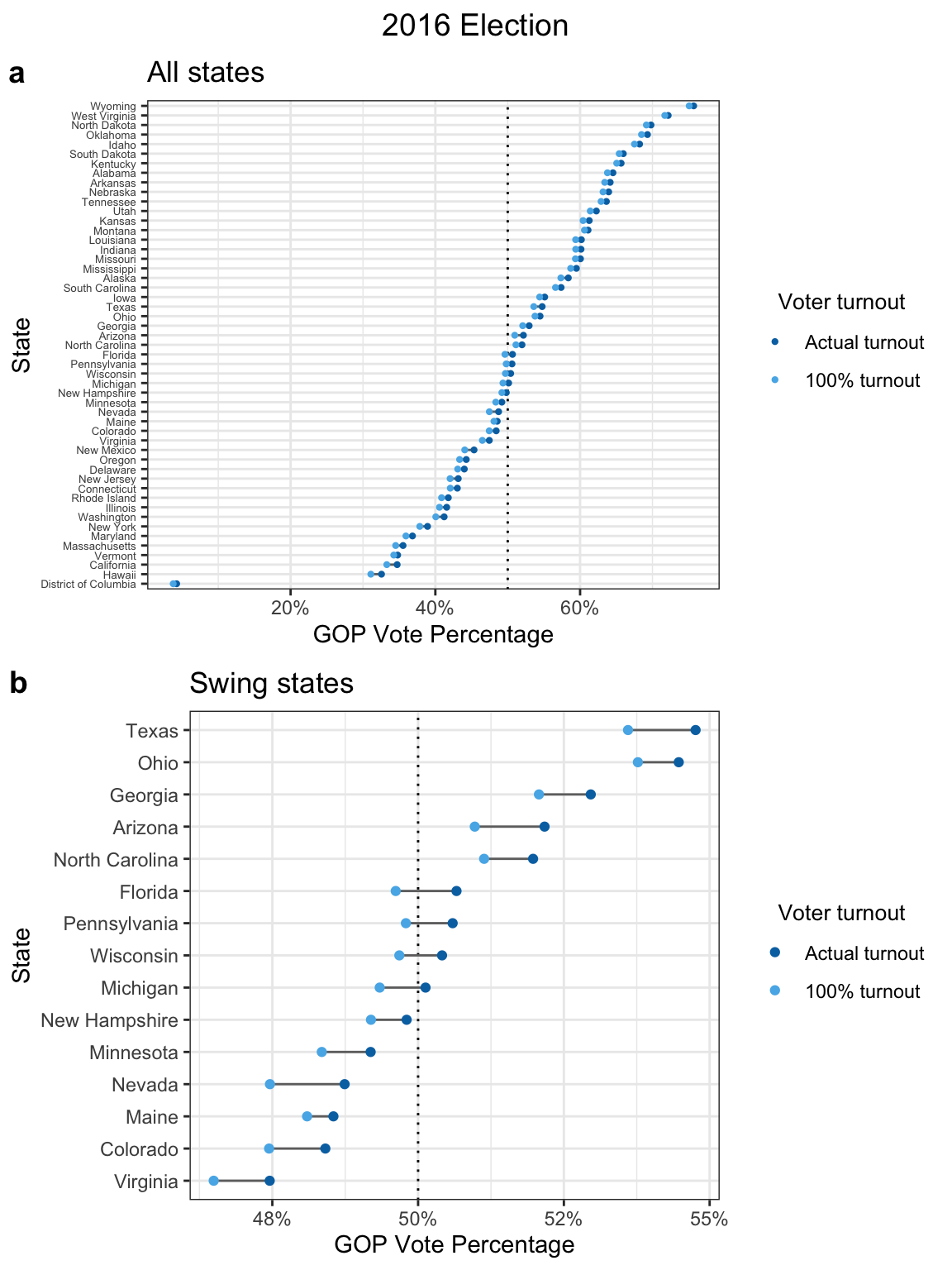
# ggsave(file = "~/Desktop/election_2016_plot.png", width = 6, height = 8)# Plot 2016 election with 2008 race turnout
dt_state_2016_combined %>%
filter(turnout_type %in% c("expected_turnout", "2008_turnout")) %>%
filter(gop_vote_percentage >= 0.45 & gop_vote_percentage <= 0.55) %>%
filter(!name %in% c("New Mexico", "Iowa")) %>%
ggplot(aes(x = gop_vote_percentage, y = name)) +
geom_vline(xintercept = 0.5, linetype = "dotted") +
geom_line(aes(group = name), color = "#6f6f6f") +
geom_point(aes(color = turnout_type)) +
scale_x_continuous(labels = scales::percent_format(accuracy = 1)) +
scale_color_manual(breaks = c("expected_turnout", "2008_turnout"),
labels = c("Actual turnout", "2008 turnout"),
values = c("#0072B2", "#CC79A7")) +
labs(title = "2016 Election",
subtitle = "Comparison to 2008 turnout rate",
x = "GOP Vote Percentage",
y = "State",
color = "Voter turnout") +
theme_bw() +
theme(plot.title = element_text(hjust = 0.5),
legend.title = element_text(size = 10),
legend.title.align = 0.5)
# ggsave(file = "~/Desktop/election_2016_plot_2.png", width = 6, height = 4)# Calculate state_level party preference in 2019
dt_state_2019 = dt_demog_state %>%
group_by(state, name) %>%
summarize_at(vars(party_pref), ~(weighted.mean(., w = turnout_weight2019))) %>%
ungroup() %>%
left_join(., state_tb, by = "name") %>%
mutate(party_pref_expected_turnout = party_pref) %>%
arrange(party_pref_expected_turnout)
# Calculate state-level party preference in 2019 under full turnout for all groups
dt_state_2019_full = dt_demog_state %>%
group_by(state, name) %>%
summarize_at(vars(party_pref), ~(weighted.mean(., w = popestimate2019))) %>%
ungroup() %>%
left_join(., state_tb, by = "name") %>%
mutate(party_pref_full_turnout = party_pref) %>%
arrange(party_pref_full_turnout)# Calculate adjusted party preferences
dt_state_2019_combined = dt_state_2019 %>%
left_join(., dt_state_2019_full %>% select(name, party_pref_full_turnout), by = "name") %>%
left_join(., dt_state_2016 %>% select(name, party_pref_expected_turnout) %>%
rename(party_pref_2016_turnout = party_pref_expected_turnout), by = "name") %>%
mutate(party_pref_adj_2016_turnout = party_pref_2016_turnout*state_bias,
gop_vote_percentage_2016_turnout = party_pref_adj_2016_turnout/(party_pref_adj_2016_turnout + 1),
gop_vote_percentage_expected_turnout = gop_vote_percentage_2016_turnout +
(party_pref_expected_turnout/(party_pref_expected_turnout + 1) - party_pref_2016_turnout/(party_pref_2016_turnout + 1)),
gop_vote_percentage_full_turnout = gop_vote_percentage_expected_turnout +
(party_pref_full_turnout/(party_pref_full_turnout + 1) - party_pref_expected_turnout/(party_pref_expected_turnout + 1)),
name = reorder(name, gop_vote_percentage_expected_turnout)) %>%
select(name, gop_vote_percentage_expected_turnout, gop_vote_percentage_full_turnout) %>%
pivot_longer(cols = starts_with("gop_vote_percentage"), names_to = "turnout_type", names_prefix = "gop_vote_percentage_", values_to = "gop_vote_percentage")# Plot 2016 election with 2019 demographics
dt_state_2019_combined %>%
filter(gop_vote_percentage >= 0.45 & gop_vote_percentage <= 0.55) %>%
filter(!name %in% c("New Mexico")) %>%
ggplot(aes(x = gop_vote_percentage, y = name)) +
geom_vline(xintercept = 0.5, linetype = "dotted") +
geom_line(aes(group = name), color = "#6f6f6f") +
geom_point(aes(color = turnout_type)) +
scale_x_continuous(labels = scales::percent_format(accuracy = 1)) +
scale_color_manual(breaks = c("expected_turnout", "full_turnout"),
labels = c("Expected turnout", "100% turnout"),
values = c("#0072B2", "#56B4E9")) +
labs(title = "2016 Election",
subtitle = "With 2019 demographics",
x = "GOP Vote Percentage",
y = "State",
color = "Voter turnout") +
theme_bw() +
theme(plot.title = element_text(hjust = 0.5),
legend.title = element_text(size = 10),
legend.title.align = 0.5)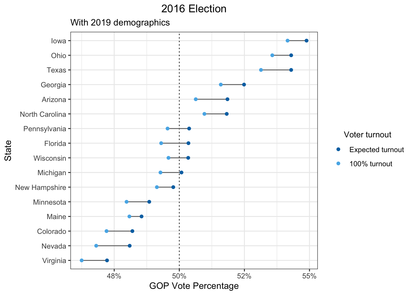
# ggsave(file = "~/Desktop/election_2019_plot.png", width = 6, height = 4)Final thoughts
I think what I’ve shown is a pretty reasonable ballpark hypothetical of what would happen if we increase voter turnout. However, I had to make a lot of decisions in my analysis, so there are caveats. I’ve listed as many as I could and grouped them into two categories: (1) analysis choices/assumptions and (2) data issues.
Analysis choices/assumptions
- State-level analysis: I only used demographic data on a state-level. If I had more time, I could have done a district/county-level analysis (such data is available). In addition, Maine and Nebraska also assign electors based on congressional districts rather than the whole state.
- Uniform demographic behavior: I assume that turnout rates and party preferences by demographic groups were the same in all states.
- No interactions between demographics: When I compute turnout rates or party preferences, I assume that the numbers for sex, race, and age can be iteratively aggregated. For example, the turnout rate for an 18-year old Asian female is computed to be the mean of the turnout rate for the age group 18-25, the turnout rate for Asians, and the turnout rate for women. The party preference is aggregated by taking the product.
- Non-demographic factors: There are other known factors that drive different party preferences and voter turnout, such as education and income. On a state level, states are known to exhibit different turnout rates that are unlikely to be completely explained by the demographic distribution (this implies that I’m overestimating the effect of increasing voter turnout when I underestimate the state turnout rate and vice versa).
- Generalizability to non-voting population: I assume that the non-voting population votes exactly the same way as the voting population based on their demographics.
- No third party: I assume that there are only 2 parties, so every party preference metric is calculated as a GOP:Democratic ratio.
Data issues
- Survey data: Party preferences and voter turnouts by demographics are based on surveys. Surveys can exhibit all sorts of bias (e.g. sampling bias, response bias). Some of my data sources do mention that they try to correct for this, but I didn’t look further into what they did.
- Voting-eligible population: The population numbers by demographic groups I use comes from the voting-age population. This is different from the voting-eligible population, since not all residents over the age of 18 are eligible to vote (e.g. non-citizens, some felons).
- Various data sources: The age groups don’t match exactly between data sources. The sources for different demographic variables and different races may be different. However, I’ve annotated every data source in the code comments for a reproducible analysis.
- Limited to 4 races: I only counted residents in 4 race groups (Non-Hispanic White, Black, Hispanic White, and Asian), given the limited data on other races.
Sources
Data sources
- Pew Research Center - An examination of the 2016 electorate, based on validated voters
- The United States Election Project - Voter Turnout Demographics
- Center for American Women and Politics - The Gender Gap in Voting: Setting the Record Straight
- U.S. Census Bureau - Age, Sex, Race, and Hispanic Origin - 5 race groups (5 race alone or in combination groups)
- Statista - Voter turnout rates among Asian voters, by age, in U.S. presidential elections, from 1996 to 2016
- Pew Research Center - A Deep Dive Into Party Affiliation
- Townhall (data scraped by tonmcg) - US County Level Election Results
- The American Presidency Project - Voter Turnout in Presidential Elections
Even though there are quite a few articles on this topic, which I’ve listed under “Related articles,” none of them do the specific quantitative analysis I was looking for.↩︎
I wasn’t aware of how extreme of an outlier D.C. was until I made this plot!↩︎
It’s also in my code because I originally did my calculations slightly differently, where the state bias variable could actually affect the analysis results, albeit to only a small degree.↩︎
Based solely on turnout rates by demographic groups.↩︎